코드랩 세미나를 준비하기 위해 한글로 정리한 자료 입니다.
https://codelabs.developers.google.com/codelabs/image-styling-web-components/#0
Image Styling with Web Components
Your Second Custom Element Let's now create a second custom element, codelab-effects. This element will render our image and possibly apply interesting visual effects to it. To start with, this is pretty much the same as the last element—with one extra det
codelabs.developers.google.com
0. 소개
Web Component란?
HTML 페이지에 재사용 가능한 요소들을 작성할 수 있는 새로운 기술
새로 사용자가 정의한 이름을 갖는다 : 내가 원하는 태그들을 모아서 캡슐화 할 수 있다.
- 라이브러리 나 프레임 워크 없이도 작성 가능
- 쉽게 재사용 및 공유 가능
- 구성되어 shadow DOM , HTML template , 및 Custom_Elements
Custom Elements(codelab-dragdrop)와 shadow DOM(codelab-effects)을 사용해서 WebComponent를 만드는 과정이다. 이것들을 결합하여 페이지로 드래그되는 이미지를 조작 할 수있는 웹 사이트를 만든다.
- Custom Elements를 선언하는 방법
- Component에 리스너와 핸들러를 추가하는 방법
- Custom Design을 캡슐화하기위한 Shadow Root를 만드는 방법
- 여러 응용 프로그램을 구성하여 작은 응용 프로그램을 만드는 방법
깃허브 저장소 : https://github.com/googlecodelabs/image-styling-web-components
googlecodelabs/image-styling-web-components
Image Styling with Web Components. Contribute to googlecodelabs/image-styling-web-components development by creating an account on GitHub.
github.com
1. Custom Elements 만들기
1-1. 기본 HTML 틀 잡기
<!DOCTYPE html>
<html>
<head>
<script>
/* code will go here */
</script>
</head>
<body>

<h1>Image Styling with Web Components</h1>

<!-- elements will go here -->

</body>
</html>
1-2. 나의 첫번째 Custom Element 만들기
이미지를 이 페이지로 드래그앤 드롭을 하기 위한 코드를 작성해 보자.
<codelab-dragdrop></codelab-dragdrop> 태그를 생성할 예정이며, 이 태그는 파일이 드롭되는 위치를 표시하는 곳을 나타낼 것이다.
이에 대한 로직은 Javascript를 이용하여 구현할 예정이다.
1. 새로운 element를 정의
2. element를 사용(인스턴스 화)
<codelab-dragdrop></codelab-dragdrop>1-3. Element 정의
Custom Element는 HTMLElement라는 ES6의 클래스를 상속받은 것 이다.
ES6는 ECMAScript6의 줄임말으로
ECMAScript6는 자바스크립트 표준 단체인 ECMA가 제정하는 자바스크립트 표준이다.
자바스크립트는 프로토타입 기반(prototype-based) 객체지향 언어다. 프로토타입 기반 프로그래밍은 클래스가 필요없는(class-free) 객체지향 프로그래밍 스타일로 프로토타입 체인과 클로저 등으로 객체 지향 언어의 상속, 캡슐화(정보 은닉) 등의 개념을 구현할 수 있다.
ES6의 클래스는 기존 프로토타입 기반 객체지향 프로그래밍보다 클래스 기반 언어에 익숙한 프로그래머가 보다 빠르게 학습할 수 있는 단순명료한 새로운 문법을 제시하고 있다. 그렇다고 ES6의 클래스가 기존의 프로토타입 기반 객체지향 모델을 폐지하고 새로운 객체지향 모델을 제공하는 것은 아니다.
[출처] https://poiemaweb.com/es6-class
<script> 태그안에 Javascript 문법을 이용해서 나의 Custom Element를 정의한다.
/* code will go here */
class CodelabDragdrop extends HTMLElement {
  constructor() {
    super();
  }

  connectedCallback() {
    // we'll do stuff here later
    console.info('Element connected!');
  }
}
customElements.define('codelab-dragdrop', CodelabDragdrop);
connectedCallback() : document의 DOM에 정의한 custom element가 맨 처음 호출되었을 때 실행된다.
customElements.defind(DOMString, class, { extends: '[tag-name]' })
- DOMString : 사용자가 element에 전달하려는 이름 (즉, 태그 네임). 이때 커스텀 엘리먼트의 이름들은 dash('-')가 포함된 이름을 사용해야하므로 주의해야한다!
- class : element의 행위가 정의된 object이다.
- extends (optional) : 상속받을 태그를 지정할 수 있다. 만약 { extends: 'p'} 이렇게 지정한다면, p 태그의 inline 성질을 갖고있는 객체가 되는 듯
개발자도구( option+command+i / F12 )를 이용해서 확인해보면 connection이 완료되었다는 메세지를 확인 할 수 있다.
2. Drag and Drop
2-1. Target 생성하기
<!-- elements will go here -->
<codelab-dragdrop>
  <div style="width: 200px; height: 200px; background: red;">
  </div>
</codelab-dragdrop>
페이지를 새로 고침하면 큰 빨간색 상자가 나타난다.
더 중요한 것은 페이지를 개발자 도구로 확인하면 codelab-dragdrop 내부에 빨간색 사각형을 보유하고 있기 때문에 현재 200 x 200 픽셀의 크기를 갖고있음을 알 수 있다.

2-2. Handler 추가하기
codelab-dragdrop에 파일을 끌어다 놓을 수 있도록 확장 해보자.
Web component가 가진 기능중에 하나는 캡슐화이다.
이를 수행할 수 있는 방법은 element defind 안에 코드를 추가하는 것이다.
이전에 작성한 ES6 클래스의 constructor element 자체에 리스너를 추가하여 메소드를 업데이트 할 것이다.
 constructor() {
    super();  // you always need super

    this.addEventListener('dragover', (ev) => {
      ev.preventDefault();
    });
    this.addEventListener('drop', (ev) => {
      ev.preventDefault();
      const file = ev.dataTransfer.files[0] || null;
      file && this._gotFile(file);
    });
  }
super()는 항상 필요하다. Web Element와 관련한 클래스인 HTMLElement 클래스를 상속받고, 그 기능을 온전히 사용하기 위해서.
ev.preventDefault() : 이벤트를 취소할 수 있는 경우, 이벤트의 전파를 막지않고 그 이벤트를 취소한다.
이전에 되어있던 이벤트 내역을 취소해 두는 느낌 인 것 같다
https://developer.mozilla.org/ko/docs/Web/API/Event/preventDefault
https://developer.mozilla.org/samples/domref/dispatchEvent.html
여기서 드래그 앤 드롭과 관련된 두 가지 이벤트를 처리합니다.
여기서 중요한 것은 drop 핸들러이다. 첫 번째 파일 (있는 경우)을 드래그하여 _getFile() 이라는 메소드를 호출하게 되어있다.
2-3. Event 방출하기
이 코드랩의 목표는 Image를 조작할 수 있는 것(조작기 - manipulator)을 만드는 것이다. 따라서 우리는 이미지를 만들고, 해당하는 조작기에 이미지를 넘겨주는 것을 목적으로 한다.
이 작업을 수행할 일반 인터페이스를 제공하는 가장 좋은 방법은 HTML 자체를 이용해서 우리가 사용 가능할 수 있게 하는 것이다.
이전 단계의 drop과 같이 event를 생성해 볼 것이다. drop된 파일에서 하나의 유효한 이미지를 생성하는 것 같이 이 이벤트는 우리의 목표에 맞게 구체적으로 설정되어있다.
(추가하면 더 많은 작업을 할 수 있다 - 예 : 이미지의 크기를 먼저 조정한 다음 보낼 수 있다.)
이 코드에서 보는 것처럼 _getFile() 이라는 메소드를 작성한다. 이것은 File을 하나의 Image로 Load하며, custom한 Image로 방출한다.
  _gotFile(file) {
    const image = new Image();
    const reader = new FileReader();
    reader.onload = (event) => {
      // when the reader is ready
      image.src = event.target.result;
      image.onload = () => {
        // when the image is ready
        const params = {
          detail: image,
          bubbles: true,
        };
        const ev = new CustomEvent('image', params);
        this.dispatchEvent(ev);
      };
    };
    reader.readAsDataURL(file);
  }
reader가 준비가 된 경우, image객체의 src(경로) 속성에 drop 이벤트를 받은 타겟인 image의 결과값을 저장한다.
그렇게 해서 image가 준비가 잘 되었을 경우에 param이라는 변수를 정의하는데 이때 detail과 bubbles라는 속성을 지정하며.
우리가 image가 잘 들어왔는지 확인을 하기 위해서 CustomEvent라는 객체를 새로 생성한다.
this.dispatchEvent(ev) : 적어도 하나의 이벤트 핸들러가 해당하는 이벤트를 처리하면서 이 메소드를 호출했다면 false를 반환하고, 그렇지 않으면 true를 반환한다.
2-4. 시도하기
개발자 도구를 열고 다음을 붙여 넣는다.
document.querySelector('codelab-dragdrop').addEventListener('image',
    (ev) => console.info('got image', ev.detail));
해당하는 곳에 image가 drop 된다면 console에 해당하는 image에 대한 정보를 보여주는 것이다.
위에서 설정한 CustomEvent가 설정되는 것.
3. Connecting Element
3-1. 나의 두번째 Custom Element 만들기
codelab-effects라는 두번째 Custom Element를 만들어 보자.
이 요소는 이미지를 렌더링하고 흥미로운 시각적 효과를 적용 할 수 있다.
class CodelabEffects extends HTMLElement {
  constructor() {
    super();
    this.root = this.attachShadow({mode: 'open'});
  }
}
customElements.define('codelab-effects', CodelabEffects);
3-2. Shadow Root 생성하기
Shadow DOM을 사용하면 실제로는 페이지에 없는 요소인 custom HTML을 추가하는 것을 허용해준다.
이때 Shadow DOM을 사용하기 위한 method가 attachShadow()인 것이다.
attachShadow()의 모드에 따라서 개발자 도구에서 해당 element의 내부에 있는 html 코드를 볼 수 있는지 없는지 여부를 판단할 수 있다.
실제 개발자 도구에서는 볼 수 없는 Element 이며, 이 것은 일반적으로 document.querySelector() 또는 getElementById()를 이용해서 호출을 할 수 있다.
모든 Custom Element에 Shadow Root가 필요한 것은 아니다.
실제로 <codelab-dragdrop> element는 새롭게 하나를 생성하지 않고도 drop된 파일을 조작하는 복잡한 로직을 수행한다. 그러나 이것은 정말 강력한 API이다.
Shadow DOM 내부의 HTML을 몇개의 코드를 추가해서 템플릿을 정의할 수 있다.
    this.root = this.attachShadow({mode: 'open'});
    this.root.innerHTML = `
<style>
:host {
    background: #fff;
    border: 1px solid black;
    display: inline-block;
}
</style>
<canvas id="canvas" width="512" height="512"></canvas>
<table>
  <tr>
    <td>AMOUNT</td>
    <td><input id="amount" type="range" min="3" max="40" value="10"></td>
  </tr>
</table>
`;
마지막으로 이 element를 codelab-dragdrop element 안에 넣는다.
이때 이전에 있던 빨간색 상자는 제거한다.
이제 codelab-effect element가 target image를 제공하는 데 도움이 된다.
<!-- elements will go here -->
<codelab-dragdrop>
  <codelab-effects></codelab-effects>
</codelab-dragdrop>
3-3. Putting It Together
이전 단계에 개발자 도구를 이용해서 event를 확인하려고 넣었던 스크립트를 기억하는가?
이 스크립트를 이용해서 이벤트를 연결해 보자!
<!-- elements will go here -->
<codelab-dragdrop id="dragdrop">
  <codelab-effects id="effects"></codelab-effects>
</codelab-dragdrop>
<script>
dragdrop.addEventListener('image', (ev) => {
  effects.image = ev.detail;  // set the image that we got in dragdrop
});
</script>
이제 image 이벤트가 발생하면(즉 image를 drop 했다는 이벤트가 발생하면) codelab-effects 요소에 있는 image 속성을 설정하도록 코드가 장성되어있다. 이제 이렇게 제공한 이미지의 픽셀 데이터를 가져오는 것을 코드에 추가해 보자.
 constructor() {
    super();
    this.root = this.attachShadow({mode: 'open'});
    // Leave the root.innerHTML part alone
  }

  // Add this method
  set image(image) {
    const canvas = this.root.getElementById('canvas');

    // resize image to something reasonable
    canvas.width = Math.min(1024, Math.max(256, image.width));
    canvas.height = (image.height * (canvas.width / image.width));

    // clone buffer to get one of same size
    const buf = canvas.cloneNode(true);
    const ctx = buf.getContext('2d');
    ctx.drawImage(image, 0, 0, buf.width, buf.height);
    this.data = ctx.getImageData(0, 0, buf.width, buf.height).data;
    console.info(this.data);
  }
setter는 클래스 필드에 값을 할당할 때마다 클래스 필드의 값을 조작하는 행위가 필요할 때 사용한다. setter는 메소드 이름 앞에
set 키워드를 사용해 정의한다. 이때 메소드 이름은 클래스 필드 이름처럼 사용된다.
다시 말해 setter는 호출하는 것이 아니라 프로퍼티처럼 값을 할당하는 형식으로 사용하며 할당 시에 메소드가 호출된다.
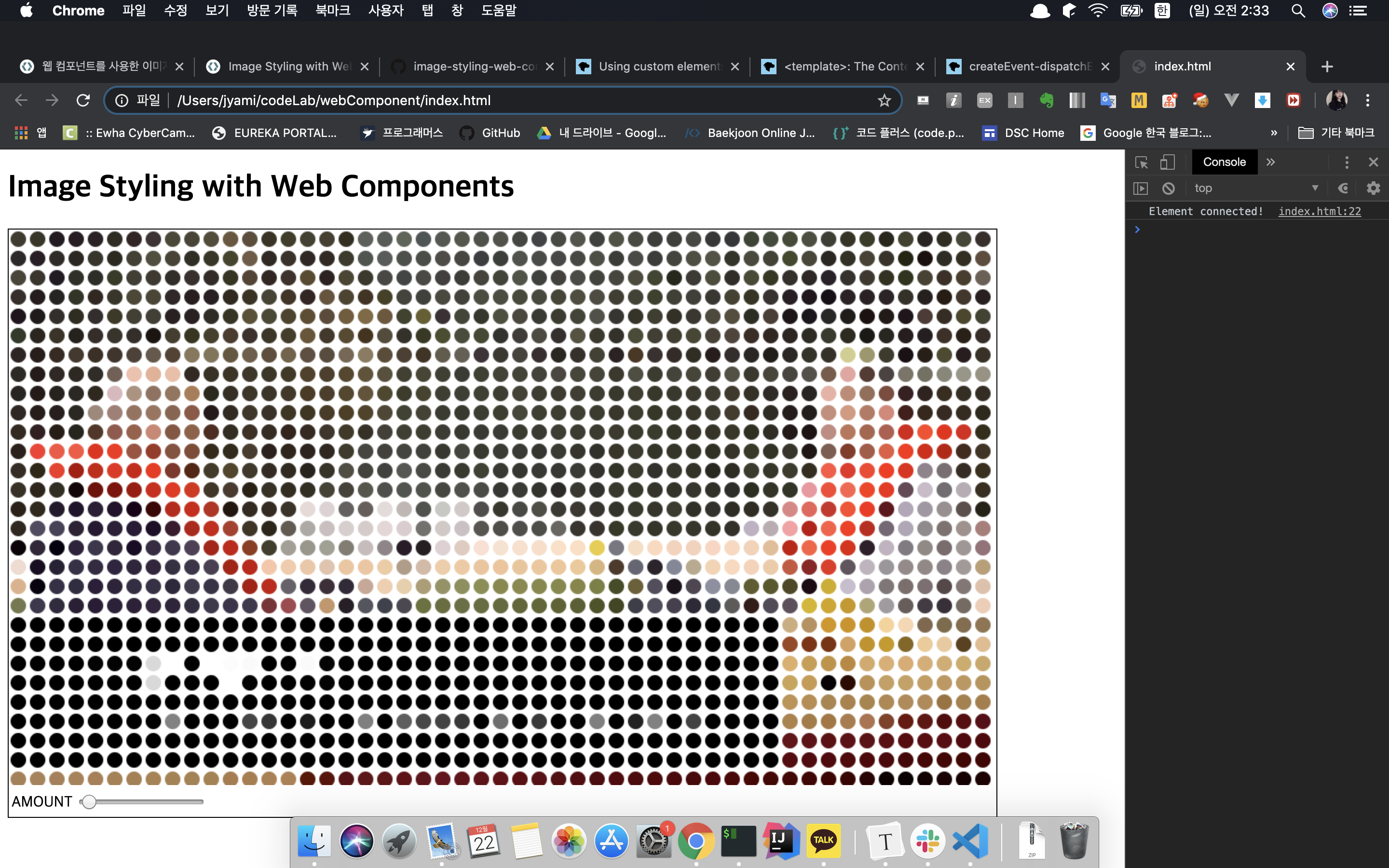
이제 이 곳에 이미지를 Drag and Drop 하면 해당하는 이미지의 픽셀 데이터를 console에서 확인 할 수 있다.

3-4. 기본 스타일링
console.log()를 이용해서 데이터 숫자값만 보기 보다는 데이터를 가져와서 실제 캔버스로 그리는 작업을 해보자.
set image 메서드 내부에서 만든 이미지 데이터를 보고 캔버스에 그린다.
이 코드랩은 캔버스 사용 및 이미지 데이터 작업에 관한 것이 아니라 웹 구성 요소를 시연하는데 도움이 되며 흥미로운 효과를 기대할 수 있다.
// Replace console.info with:
this.draw();
}
// And add this method
draw() {
const canvas = this.root.getElementById('canvas');
canvas.width = canvas.width; // clear canvas
const context = canvas.getContext('2d');
const amount = +this.root.getElementById('amount').value;
const size = amount * .8;
for (let y = amount; y < canvas.height; y += amount * 2) {
for (let x = amount; x < canvas.width; x += amount * 2) {
const index = ((y * canvas.width) + x) * 4;
const [r,g,b] = this.data.slice(index, index+3);
const color = `rgb(${r},${g},${b})`;
context.beginPath();
context.arc(x, y, size, 0, 360, false);
context.fillStyle = color;
context.fill();
}
}
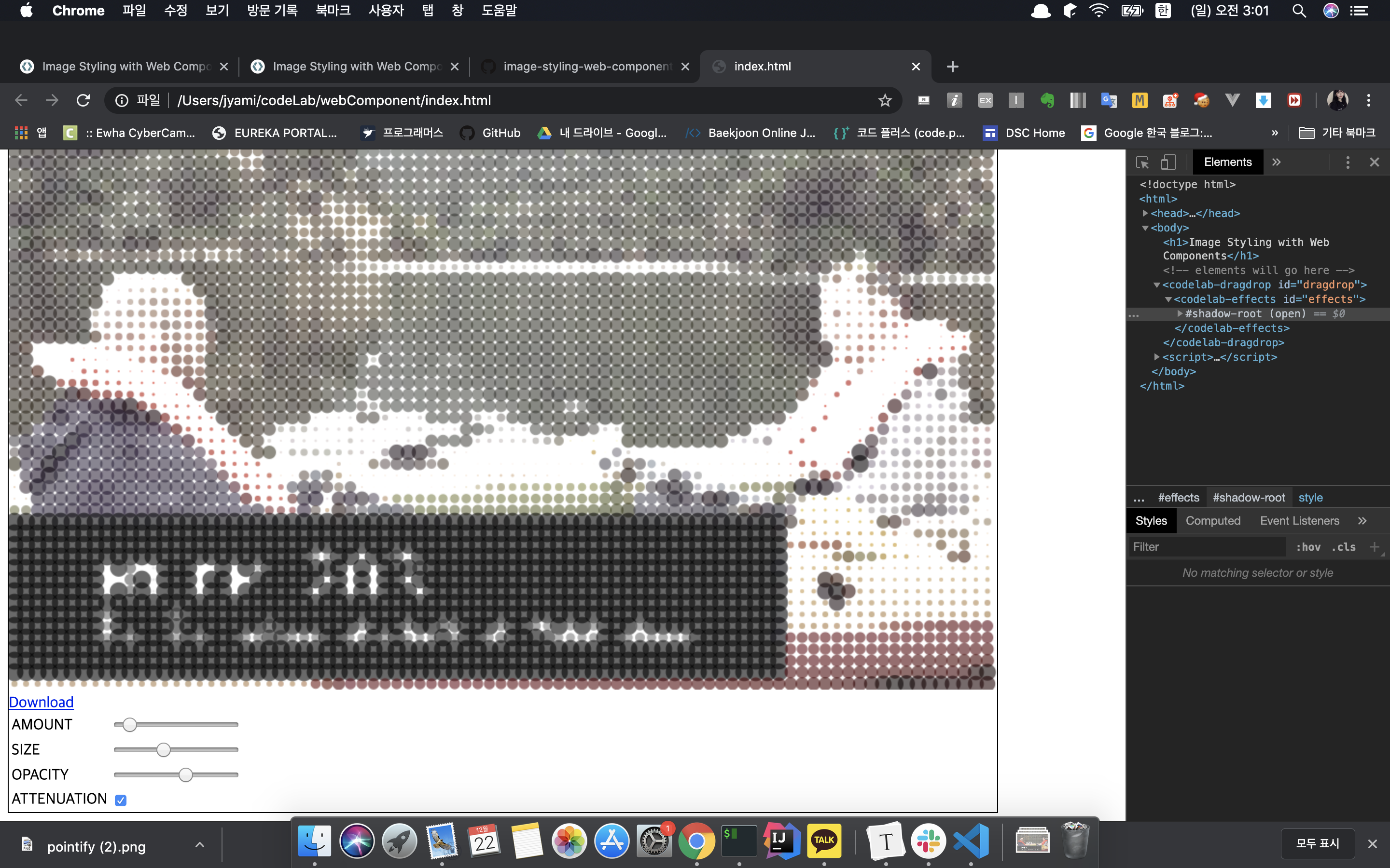
}페이지를 새로 고침하고 좋아하는 이미지를 페이지로 드래그하면 점묘 효과가 나타난다.
4. Saving Images
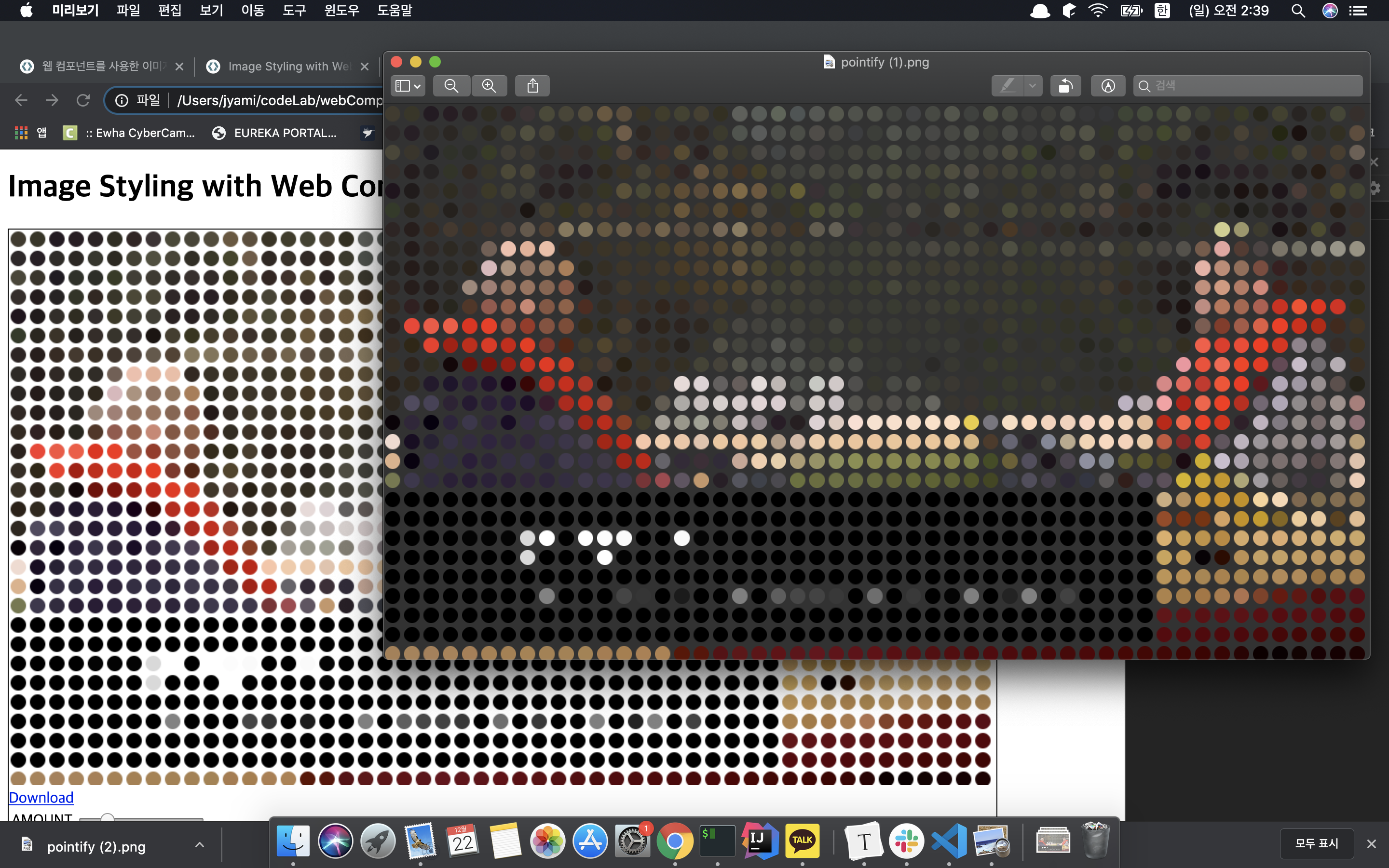
4-1. Click To Download
방금 만든 점묘화의 이미지를 공유하거나 사용하기 위해서는 마우스 오른쪽 버튼을 클릭해서 이미지를 다운로드 해야한다.
대신 canvas 아래에 링크를 추가하여 이미지를 자동으로 다운로드를 할 수 있도록 환경을 만들어 볼 예정이다.
    this.root.innerHTML = `
...
<canvas id="canvas" width="512" height="512"></canvas>
<br /><a href="#" id="link">Download</a>
...
`;
그리고 이 link라는 id값을 받아서 download 할 수 있도록 이벤트 핸들러를 설정한다.
    // And add this handler
    const link = this.root.getElementById('link');
    link.addEventListener('click', (ev) => {
      link.href = this.root.getElementById('canvas').toDataURL();
      link.download = 'pointify.png';
    });
다운로드 완료!!
5. Control 추가
5-1. 응답하기
"AMOUNT" 슬라이더를 활용해보자! 이 것을 활용해서 우리가 그리는 점묘화의 점의 크기를 제어할 수 있다. 그러나 현재는 이미지 자체가 드롭될 때 한번만 발생하기 때문에 코드를 수정해보자
CodeLabEffects 클래스의 생성자 안에 리스너를 추가해 보자.
다시 리마인드 하면 이것은 this.root는 AMOUNT 슬라이더를 포함한 모든 Shadow DOM이 있는 곳이다.
이것은 Shadow DOM element에 의해 생긴 모든 변경에 응답하고 draw 메소드를 호출한다.
...
      link.download = 'pointify.png';
    });

    //add these two new listeners
    this.root.addEventListener('input', (ev) => this.draw());
    this.root.addEventListener('change', (ev) => this.draw());

  }
input이나 change와 관련한 이벤트가 들어왔을 경우에 draw()를 다시 실행한다.
5-2. 고급 컨트롤
shadow DOM에 컨트롤을 추가한다.
    this.root.innerHTML = `
... <!-- add some new <tr>'s at the bottom -->
  <tr>
    <td>SIZE</td>
    <td><input id="size" type="range" min="0" max="4" step="0.01" value="1"></td>
  </tr>
  <tr>
    <td>OPACITY</td>
    <td><input id="opacity" type="range" min="0" max="1" step="0.01" value="1"></td>
  </tr>
  <tr>
    <td>ATTENUATION</td>
    <td><input id="attenuation" type="checkbox"></td>
  </tr>

</table>
`;
렌더링 코드인 draw() 역시 컨트롤에 따라 조금 수정해준다.
draw() {
    const canvas = this.root.getElementById('canvas');
    canvas.width = canvas.width;  // clear canvas
    const context = canvas.getContext('2d');

    const attenuation = this.root.getElementById('attenuation').checked;
    const amount = +this.root.getElementById('amount').value;
    const size = this.root.getElementById('size').value * amount;
    const opacity = this.root.getElementById('opacity').value;

    for (let y = amount; y < canvas.height; y += amount * 2) {
      for (let x = amount; x < canvas.width; x += amount * 2) {
        const index = ((y * canvas.width) + x) * 4;
        const [r,g,b] = this.data.slice(index, index+3);
        const color = `rgba(${r},${g},${b},${opacity})`;

        const weight = 1 - ( this.data[ index ] / 255 );
        const radius = (attenuation ? size * weight : size);

        context.beginPath();
        context.arc(x, y, radius, 0, 360, false);
        context.fillStyle = color;
        context.fill();
      }
    }
  }
size : 원의 기본 반경을 제어한다
opacity : 원의 투명도를 제어한다.
attenuation : 각 원의 어두운 정도에 따라 원의 크기를 조정한다.
5-3. 추가 기능
이미지 전체를 색조로 만드는 컬러 필터
다른 모양을 사용
정렬되지 않은 배치 등
이 component element 에는 많은 가능성이 있다!
Polymer와 같은 다양한 Web Component Element 라이브러리도 있다.
이 라이브러리에는 지금 렌더링 수준의 그림 하나하나 생각했던 것과 같은 Low Level의 Component Element보다 좀더 High Level 계층의 추상화된 라이브러리를 제공한다.
'Develop > Web' 카테고리의 다른 글
| Thrift 뽀개기 (0) | 2023.02.23 |
|---|---|
| web & server - DSC Ewha 세션 (0) | 2019.10.15 |

